
CSS margin vs padding: Which drag and drop website builder has the best in 2023
The world of website building has grown exponentially in the past few years, and so have the options available for margin and padding in drag and drop website builders. As small business owners want to have more control over the look and feel of their website, the importance of these tools cannot be understated.
Margin and padding are two very different elements in CSS (Cascading Style Sheets). While these two can be a bit confusing to beginners, understanding their differences and knowing how they work is essential for designing an aesthetically pleasing and functional website.
These two terms, often used interchangeably plays critical rule in the web development process. Lets start by understanding what they really are.
CSS margin properties
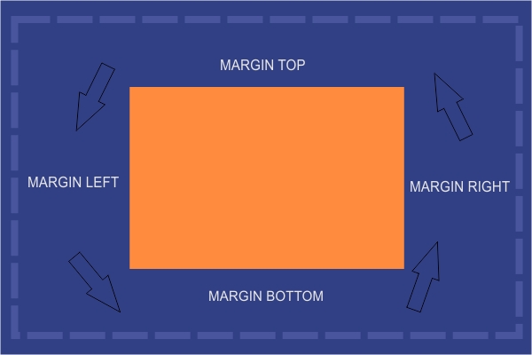
Margins are the empty space between elements on a web page. They affect how elements appear in relation to each other. The larger the margin, the more space or distance between them.

Margins also influence how much white space appears on a web page; reducing margins creates tighter layouts that don't seem too spread out but keeps contents inline or overlapped.
How to Add Margins in CSS
Adding margins to an element in CSS is quite simple. By declaring a margin property with a numerical value, you can adjust the space between any HTML element.
Unlike padding, adding 'margin: 20px;' to an element will create a 20-pixel gap of space around that item on the page, meaning the four margins will have the same value. This is made possible when using the Shorthand method.
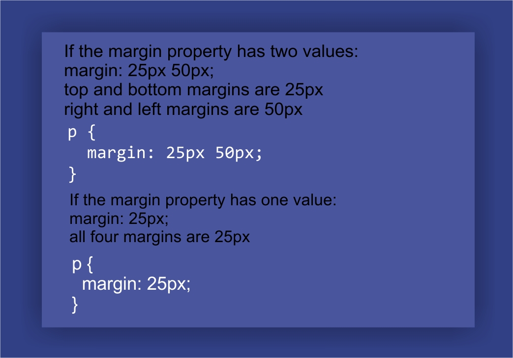
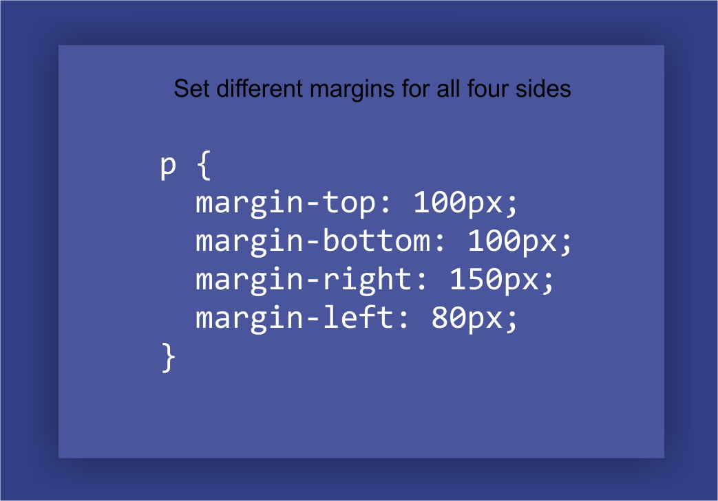
The Shorthand margin property allows you to specify the margin around an element in one line. It can save time as it eliminates the need to write separate margins for individual properties like top, bottom, left and right. This shorthand includes four properties - margin-top, margin-bottom, left margin and right margin.
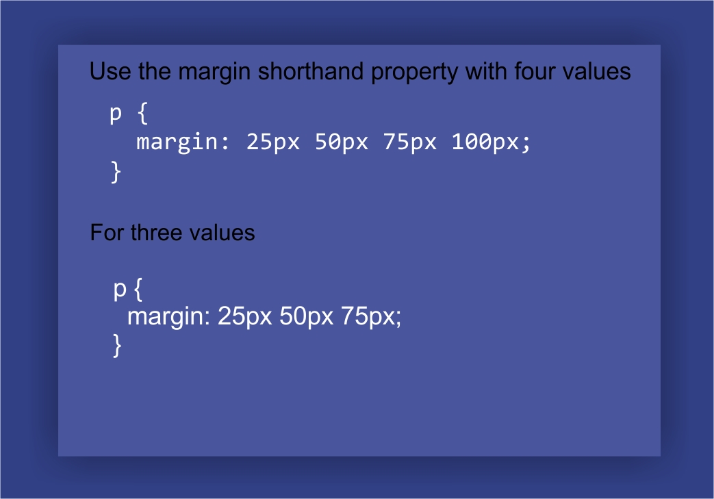
The shorthand margin property is easier to read, maintain and debug than having different margin value for each side of the elements.
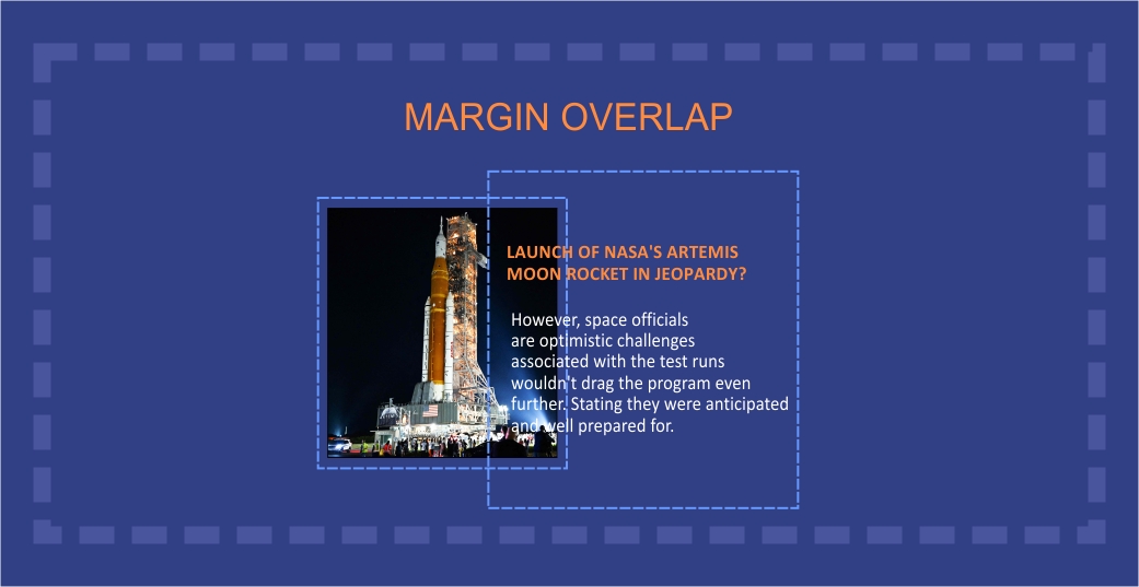
The shorthand margin property does not take negative values hence overlapping elements are not possible with this method.
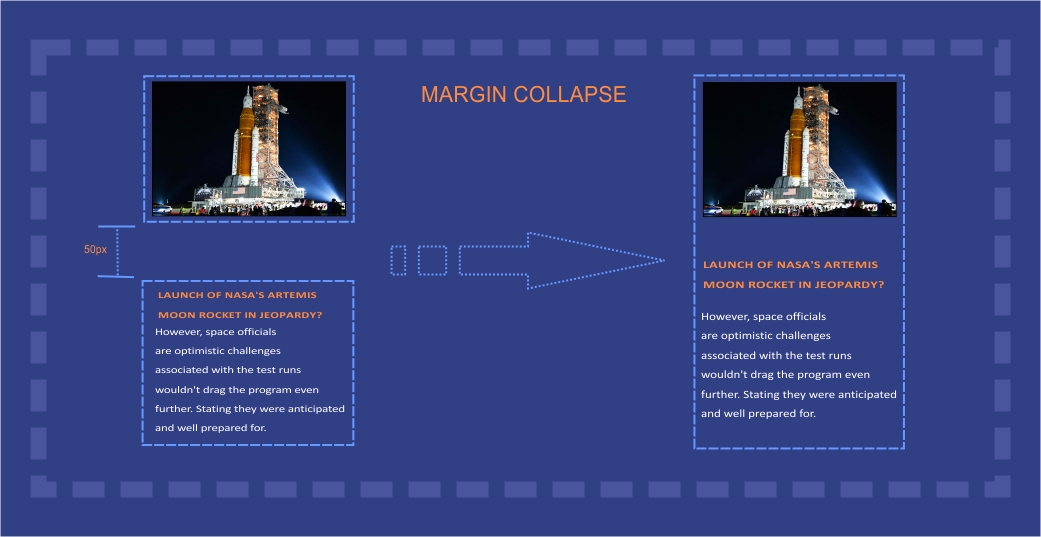
CSS Margin collapse helps to merge Margin top and Margin bottom into a single margin which does not apply to the left and right sides. It allows nested elements to interact and "collapse" their margins together, therefore allowing for more precision and control when it comes to page design.
This is incredibly useful for creating uniformity on a web page and taking into account various degrees of spacing between elements. Knowing how to use this feature properly can be very beneficial in making sure your website looks professionally designed and polished.
when and where to Use Margin
Set the Distance between nearby elements
Change an element’s position and size on the page
To overlap elements
To inline elements on web pages.
CSS padding properties
Padding, on the other hand, determines how much space comes between an element's content and its border property or frame and does not take into account adjacent elements in the parent box.
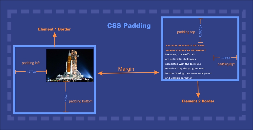
Unlike margins, padding affects only one element at a time. If you increase the padding of one element, it won't affect any other elements on the page.
Padding property defines the amount of space that surrounds components using the given padding values and does not take negative values.
How to Add padding in CSS
Adding padding in CSS is a simple way to make your webpages look more organized and neat. You can add padding around any element or all elements on a page, depending on the look you are trying to achieve.
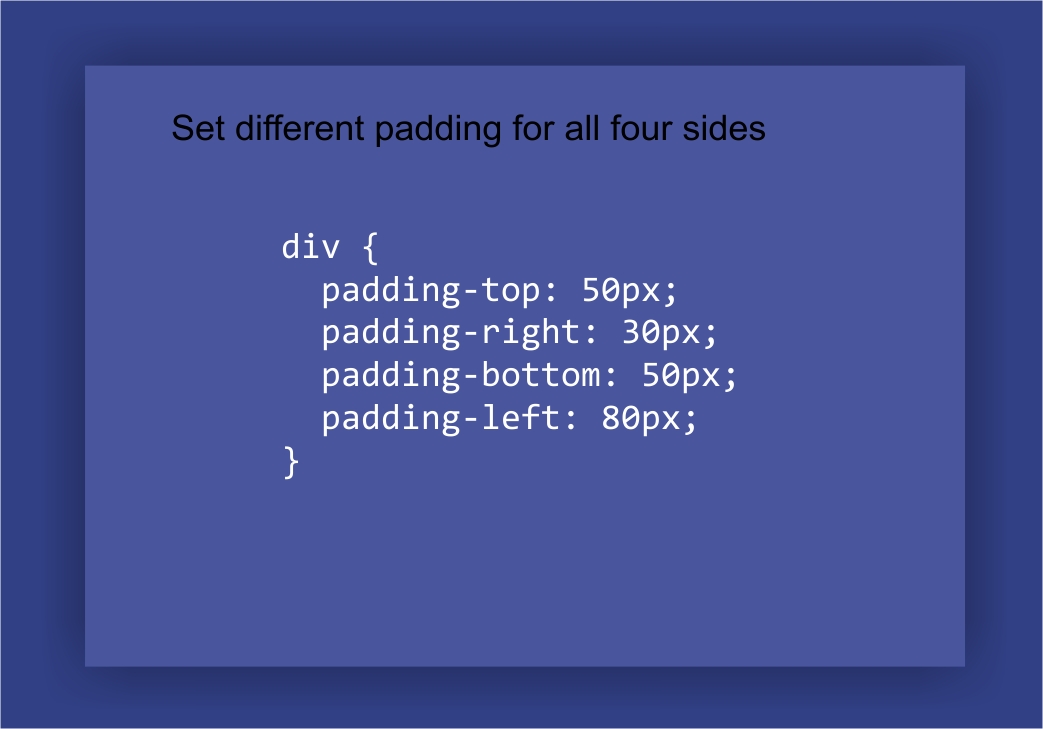
To add padding in CSS, you will need to use the padding property in your style sheet and then specify the number of pixels you would like each element to have. For larger elements, you may wish to use different values for top, bottom, left and right margins.
It is important to remember that when adding padding around an element that has a border, the width of the entire box expands while retaining uniformity of space between elements.
Padding adds much-needed breath-ability between each element, helping to increase overall readability and keep your web page from looking cluttered.
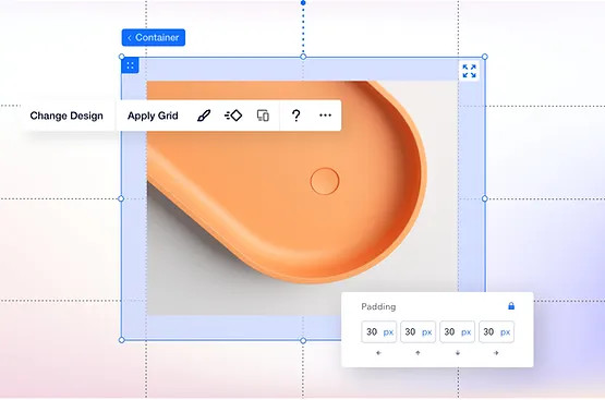
Use the shorthand padding property to write simple but effective lines of code, try as demonstrated in the images below.
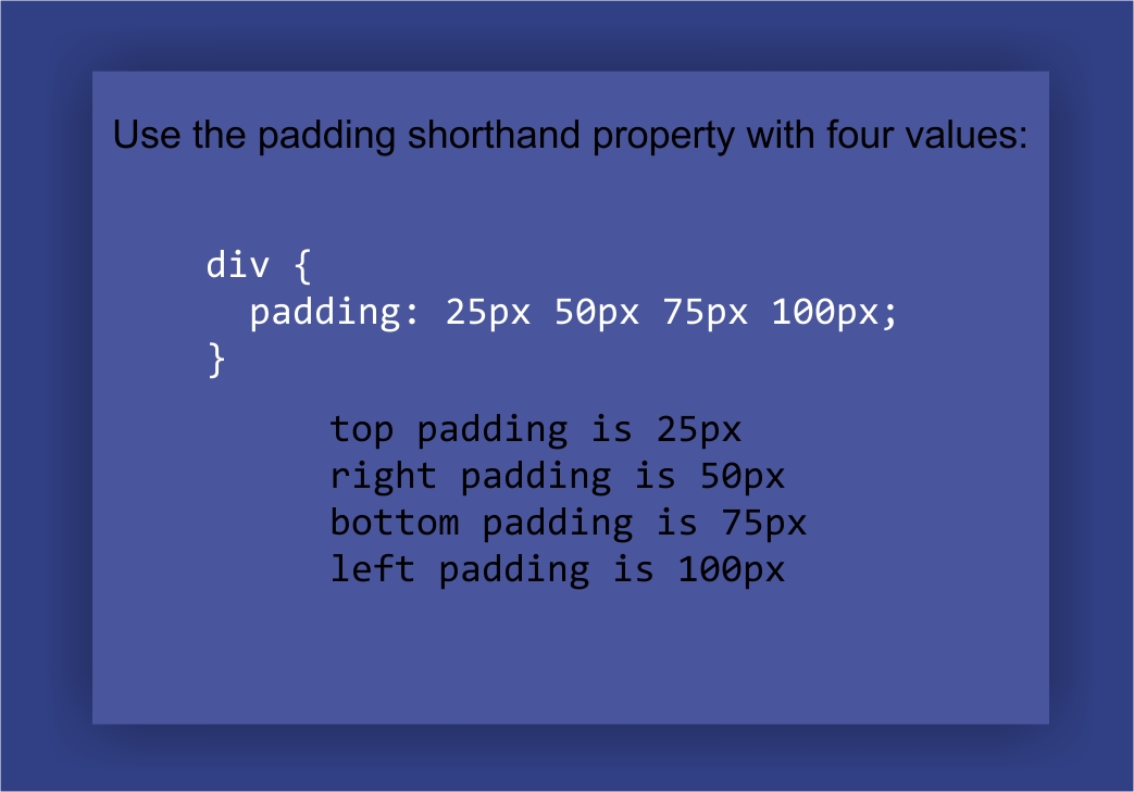
Put all the four sides into one single line of code
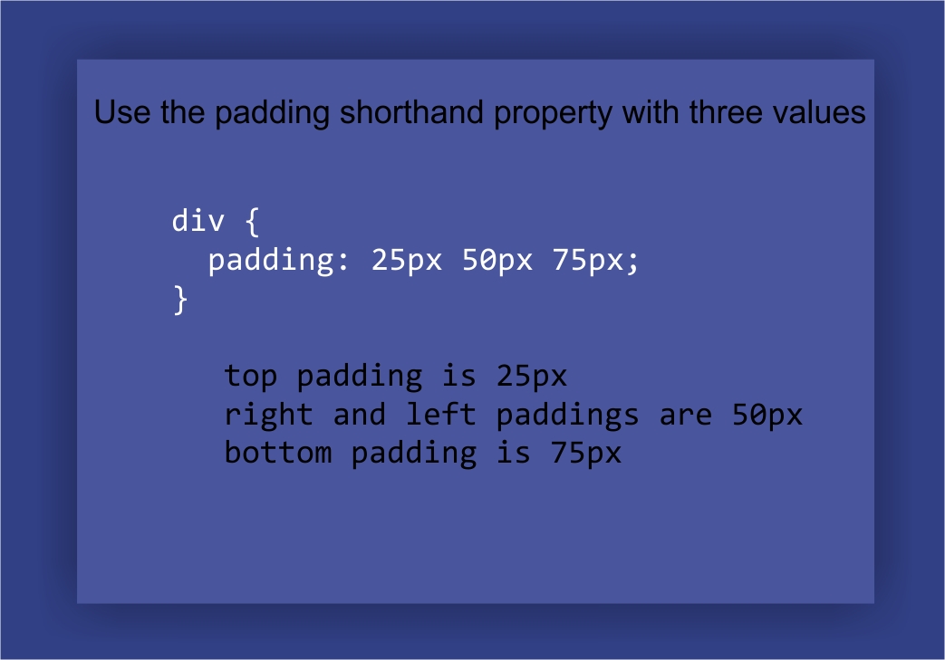
Handle three value sides with the padding shorthand property
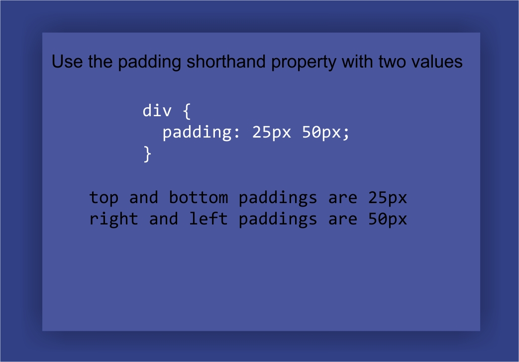
Two value shorthand padding property
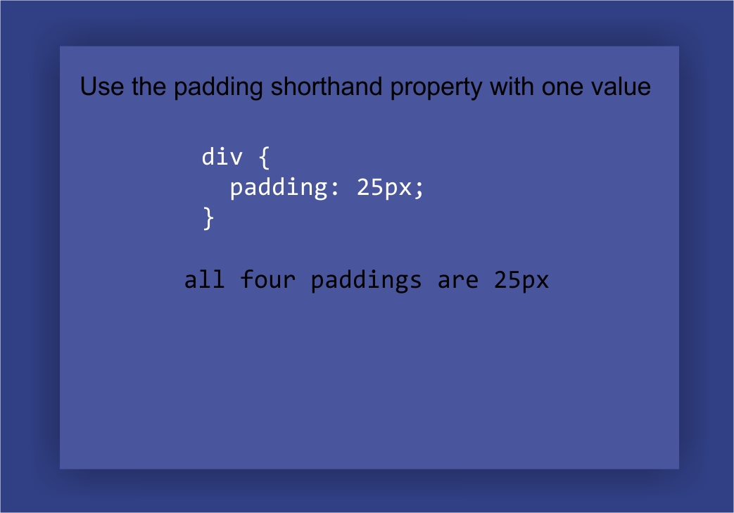
One value shorthand padding property
When and where to Use Padding property
Add Space Between Content and Its Border box
Change the Size of an Element's border box
Similarities and Differences between Margins and padding properties
Both margin and padding controls can be specified in terms of pixels, percentages, or ems.
Margin is used to control the white space outside an element or a group of elements. It’s like setting up boundaries around the space that you have available.
Padding, on the other hand, controls the space inside an element or group of elements. Think of it as creating extra room for elements within those boundaries set by margins.
The main difference between the two properties is that margins can be set to negative value, while padding cannot. This can be useful for creating overlap between elements, but it can also lead to unpredictable results and should be used with caution.
In summary, margins are for setting up boundaries, and padding are for creating space within existing boundaries. Together, they can be used to create beautiful designs that look polished and professional.
CSS box model
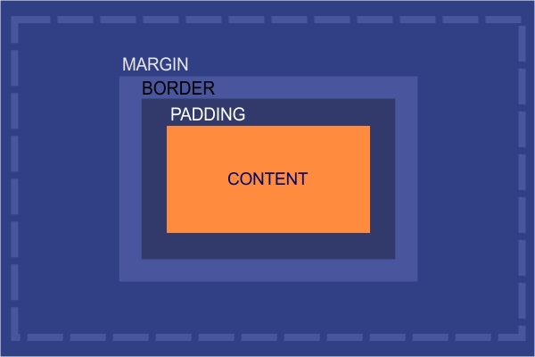
The CSS box model can simply be described as a box wrapped around every HTML element on a web page.
The CSS box model gives you an intuitive visualization of the structure used to lay out every HTML element on a webpage. To construct this layout, a rectangular outline commonly referred to as a box encircles each HTML element.
This box comprises four individual components:
Non-content area -- the margins, borders, and padding;
Content area -- where actual text or images are placed;
Width and height -- observable dimensions of the border around the content; and
Display type -- determines how HTML elements will be shown if fit into a window size.
When constructing pages for web design, comprehending the various parts of the CSS box model provides essential insight into building great, responsive websites.
best drag and drop website builders with padding and margin properties
When it comes to creating a website from scratch, the drag and drop page builders are becoming the most popular option. Unlike manually writing your website code from scratch, these are done automatically by the intelligent page builders on your behalf.
Finding an intuitive drag and drop website builder with comprehensive padding and margin options is key to creating a successful e-commerce store.
With a rising competition, we take a look at the level of flexibility and customization options available on these platforms and how each stack-up padding and margin settings against the other.
Let's analyse these six popular contenders and compare their features
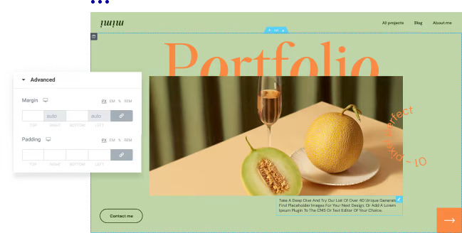
Zyro
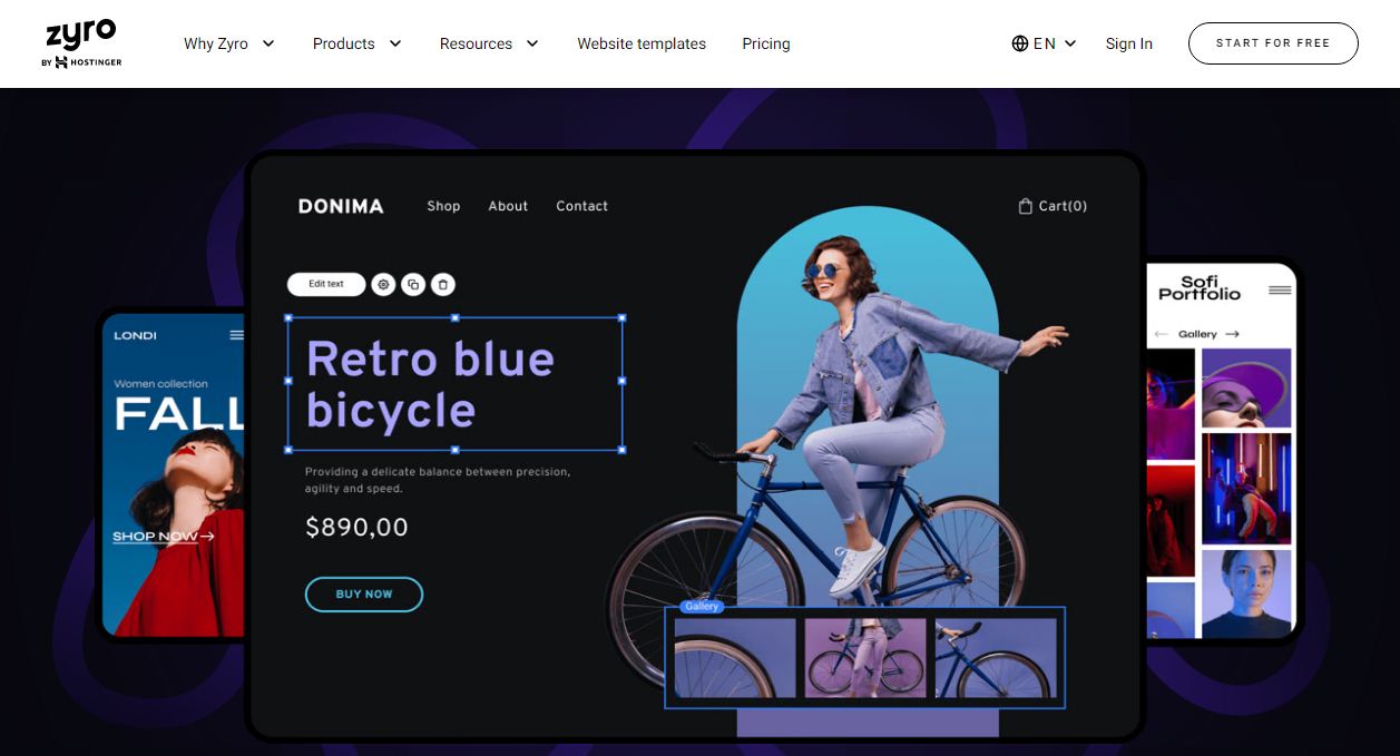
Zyro page builder harnesses the power of AI to make building web pages easier than ever. With it, you can quickly and easily position elements on the page using padding and margin that best reflect your design vision.
Its AI algorithm allows for complete customization, making sure that each element blends in harmoniously with all other corresponding components using the inbuilt margin and CSS padding properties.
In addition, Zyro helps guide the user through the complexity of web development, allowing them to explore their options without any compromises.
To use padding and margin in Zyro, click on the desired element to highlight it. Using the mause pointer, drag to resize and reposition image or text blocks.
Elementor
In terms of padding and margin capabilities, Elementor stands out from the crowd, thanks to its advanced page builder that allow users to make changes to their website’s design quickly and effectively.
This includes being able to change the size of certain sections using margin controls and add different elements like buttons or images without having to manually rewrite codes
It also offers a wide range of options for styling and adding effects to your content, such as background colors, buttons, headings, borders, text alignment and more. Additionally, Elementor’s drag-and-drop interface makes it easy to reposition elements with just a few clicks.
To use the padding and margin properties in elementor, select the section or column and navigate to the advance section.
Toggle the hook icon to have the same padding value for the left padding, right padding, padding top and padding bottom, same applies to the margin values.
Divi

Divi is a world-renowned page builder that helps web designers to create beautiful, fully customized websites with ease. An integral part of website building involves setting the padding and margin of the various sections on a web page and Divi has what it takes to make that happen
Divi has a well structured CSS box model combined with other features such as the advance responsiveness tool, making its padding and margin features are powerful for creating dreamy yet functional websites.
In Divi, you can easily adjust margins using the drag and drop interface; simply select an element and use the margin control to make changes. Easily set negative margins and align element horizontally.
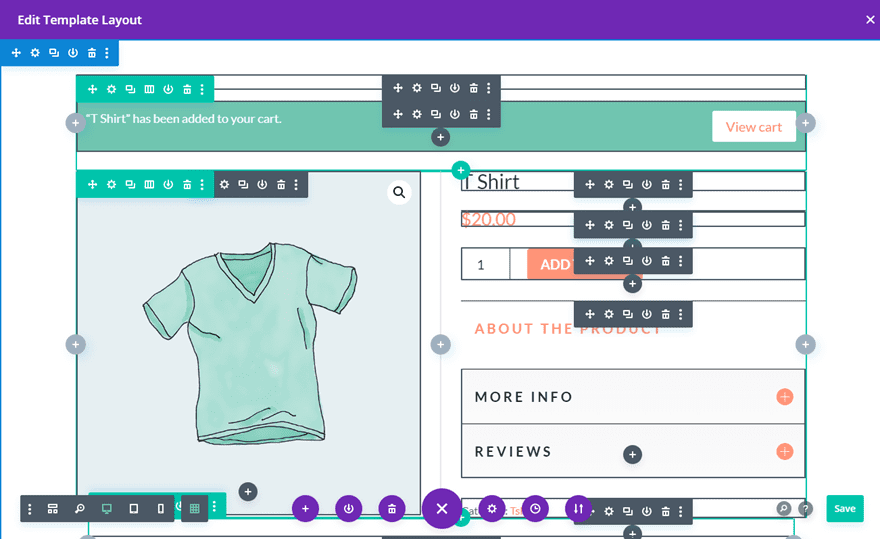
As with margins in Divi, changing aspects of elements on a page such as the left padding is quick and easy; just select an element and use the padding control to make adjustments.
Squarespace

Squarespace provides a simple, yet sophisticated solution for creating stylish and professional websites. With its drag-and-drop page editor, it's easy to customize your pages using gorgeous designs and custom margin/padding options that make sure your site stands out from the rest.
While it does have limited padding and margin options, the intelligent page editor was primarily built to helps align element horizontally while making use of the CSS border property to ensure an even layout.
HostGator

HostGator is revolutionizing the way people design their online content. Not only does it give users ultimate flexibility in terms of choosing specific positioning elements, but it also offers support through graphical displays of the margins and padding associated with each element.
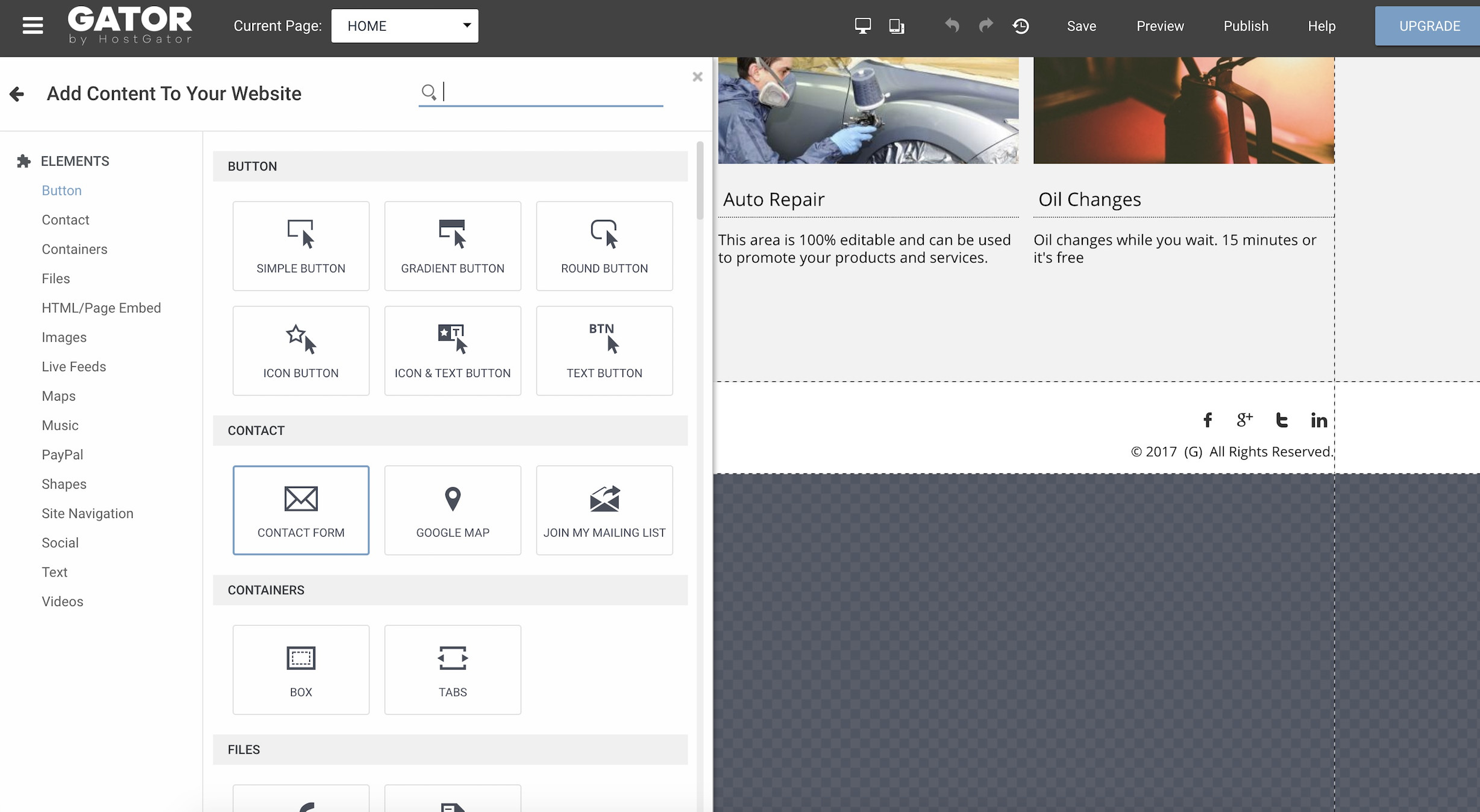
As a result, you have complete freedom to decide the overall look and feel of your web pages. Beyond this, HostGator's page building capabilities make adjusting items such as font size or moving an element across the page effortless - saving you time and increasing productivity.
Wix
Wix is another popular website builder that offers a wide range of customization options. It has advanced tools for setting margin and padding values on each element of the page, making it perfect for those who want more control over their design.
Placing page elements has never been simpler or quicker. You can use padding and margin to create well structured designs without any hiccups. Moreover, these tools help to separate text, tap targets and images in a clear effective manner with ease.
Why margin and padding are important for e-commerce
CSS Padding and Margin are two important tools used in web design. Margins create space between elements, while padding creates space inside elements. For e-commerce websites, this has a huge impact on user experience.
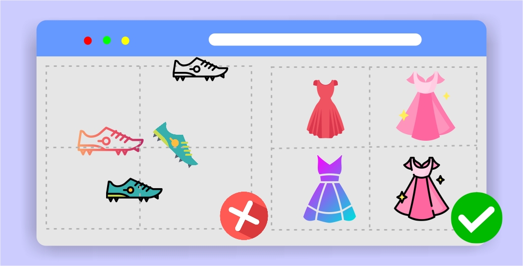
By creating adequate spacing between items, visuals become more organized and attractive, making it easier for customers to find what they're looking for quickly and effortlessly.
To ensure better user experience, the outer space around your product listings and the inner space to which the product image is confined should be marginally calculation to accommodate different device layouts.
Likewise, using padding within elements ensures that text or images don’t run into each other when the page is resized or viewed in different browsers.
Remember, CSS styling concepts control your web design and functionality. Online store design best practices generally rely on basic web design components to define its structure, functionality and responsiveness.
Pros of using css margin and padding properties
They can help to improve the readability of a page by creating white space around text and images.
They can be used to control the layout of a page by creating space between elements.
They can be used to add visual interest to a page by creating different levels of spacing between elements.
margin can be used to create gaps between sections of a page, which can be useful for visual hierarchy
Cons of using css margin and padding properties
One potential downside to using margin and padding is that it can add extra space around elements, making it difficult to align items on the page.
Another potential downside is that margins and padding can interact in unexpected ways with other CSS properties, such as borders. If you're not careful, you may end up with results that are different from what you intended.
Using too much margin and padding can make a page look cluttered and busy, which can be off-putting to users.
They sometimes add invisible space to element's border.
CSS margin vs padding: Which one is better for you
In general, margin and padding are both useful tools for creating whitespace, but they should be used in different ways depending on the desired effect. To deal with inner element use padding, for inline element use margins.
Conclusion
When selecting a drag and drop website builder for your website and e-commerce store, consider its capabilities with respect to margin and padding settings.
As explained, some website builders may have limited options when it comes to customizing margins and padding, so you’ll want to make sure it suits your specific needs.
Now that you know the basics of margins and padding in CSS, it's time to get out there and show the world your style. Start experimenting with different values to see what works best for your design; who knows, you might just have the next trend-setting layout.


